Parameters
Where the divider sits, from the start edge (0) to the end edge (1). The component keeps its own position after the user moves it, and follows this again whenever you change it.
Vertical is an upright divider you drag left and right; horizontal is a flat divider you drag up and down.
The colour of the divider line and the round handle. The arrows on the handle turn light or dark to stay readable.
The thickness of the divider line; 0 leaves just the handle.
The diameter of the round grab handle.
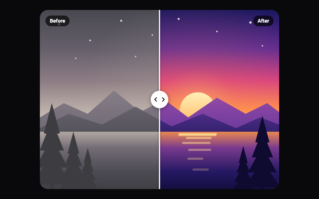
Shows Before and After pills in the corners, which fade as the divider comes near them.
Dark: white text on a dark pill. Light: dark text on a light pill. Outline: white text in a thin outline.
When the component first appears, sweeps the divider a little to each side once to show that it moves. Skipped for reduced motion; turn it off and on again to replay it.
The built-in pair of pictures drawn when no before or after widget is given: a dusk landscape, dull before and vivid after, or coloured shapes in grayscale and in colour.
A second tap soon after the first sends the divider back to the middle.
Loading Preview…
Send to your coding agent
Add Sheen's MCP server once, then paste the prompt. No key or account needed.
claude mcp add --transport http sheen https://sheen.ciroapps.com/api/mcp
Use the Sheen MCP server to add the Before/After Slider Component to this Flutter app. Call get_export with componentId "before-after-slider" and parameters {"position":0.5,"orientation":"vertical","handleColor":"FFFFFF","dividerWidth":3,"handleSize":44,"showLabels":true,"labelStyle":"dark","introHint":true,"sampleScene":"landscape","doubleTapToCenter":true}, then follow the install steps it returns. (Tuned in the Sheen Playground: https://sheen.ciroapps.com/c/before-after-slider?position=0.5&orientation=vertical&handleColor=FFFFFF÷rWidth=3&handleSize=44&showLabels=true&labelStyle=dark&introHint=true&sampleScene=landscape&doubleTapToCenter=true)