Parameters
The items and title shown when you don't pass your own items. Only for trying the Component out.
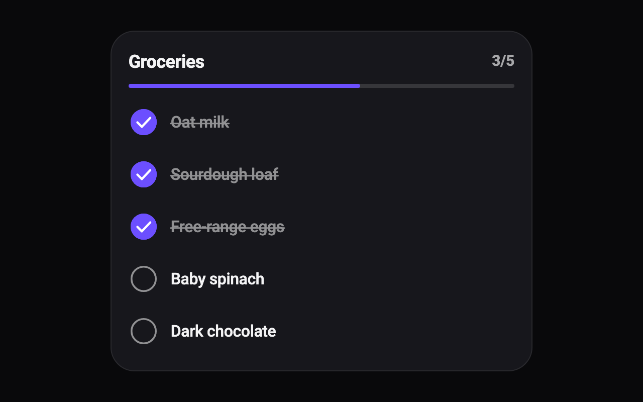
How many items start ticked, from the top. Changing it later ticks or unticks to match, as a parent changing the ticks would.
The colour of ticked circles, the progress line and the button.
The colour of the card behind the rows.
The colour of item labels and the title; ticked items dim from it towards the card colour.
How a ticked item's label is marked: a thin line drawn across it, a bolder line in the accent colour, or only dimmed.
Shows the count (such as 3/5) and the progress line that fills as items are ticked.
Slides a button in under the list once every item is ticked.
How tall each row is: 44, 52 or 60 logical pixels at least.
Loading Preview…
Send to your coding agent
Add Sheen's MCP server once, then paste the prompt. No key or account needed.
claude mcp add --transport http sheen https://sheen.ciroapps.com/api/mcp
Use the Sheen MCP server to add the Checklist Component to this Flutter app. Call get_export with componentId "checklist" and parameters {"sample":"groceries","checkedCount":3,"accentColor":"6C4FFF","cardColor":"17171C","textColor":"F4F4F5","strikeStyle":"line","showProgress":true,"showCta":true,"density":"regular"}, then follow the install steps it returns. (Tuned in the Sheen Playground: https://sheen.ciroapps.com/c/checklist?sample=groceries&checkedCount=3&accentColor=6C4FFF&cardColor=17171C&textColor=F4F4F5&strikeStyle=line&showProgress=true&showCta=true&density=regular)