Parameters
Where it starts, from 0 to 100, snapped to the nearest detent. It keeps the user's value after that, and follows this again whenever your code changes it.
How many steps the track is divided into: the thumb snaps to each, with a tick mark and a click. 0 (or 1) makes it continuous.
The colour of the filled part of the track and of the value bubble.
The colour of the unfilled part of the track.
The colour of the thumb. Tick marks, icons and the value are drawn in it too, more faintly, so pick one that reads on your background.
The thickness of the track in logical pixels. The thumb and icons grow with it.
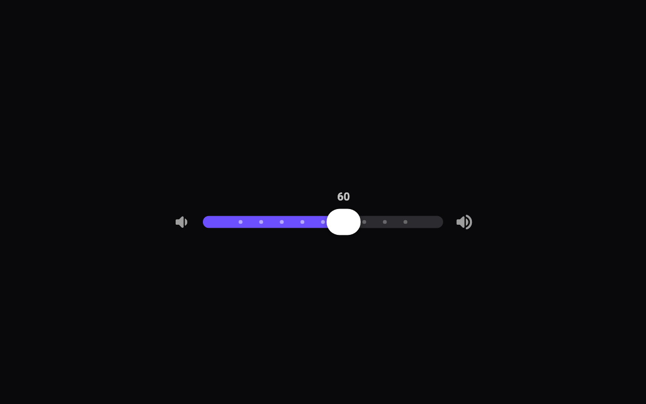
Shows the value above the thumb: small at rest, springing up into a bubble while dragging. It reserves room above the track.
A selection click at each detent crossed (or at the ends when continuous), on phones that support it.
A pair of icons at the low and high ends of the track. They step aside when the slider is too narrow for them.
How much the thumb overshoots and wobbles as it settles, and the bubble as it springs up.
Loading Preview…
Send to your coding agent
Add Sheen's MCP server once, then paste the prompt. No key or account needed.
claude mcp add --transport http sheen https://sheen.ciroapps.com/api/mcp
Use the Sheen MCP server to add the Detent Slider Component to this Flutter app. Call get_export with componentId "detent-slider" and parameters {"value":60,"detents":10,"activeColor":"6C4FFF","trackColor":"2C2C30","thumbColor":"FFFFFF","height":12,"showValue":true,"haptics":true,"icons":"volume","bounciness":0.4}, then follow the install steps it returns. (Tuned in the Sheen Playground: https://sheen.ciroapps.com/c/detent-slider?value=60&detents=10&activeColor=6C4FFF&trackColor=2C2C30&thumbColor=FFFFFF&height=12&showValue=true&haptics=true&icons=volume&bounciness=0.4)