Parameters
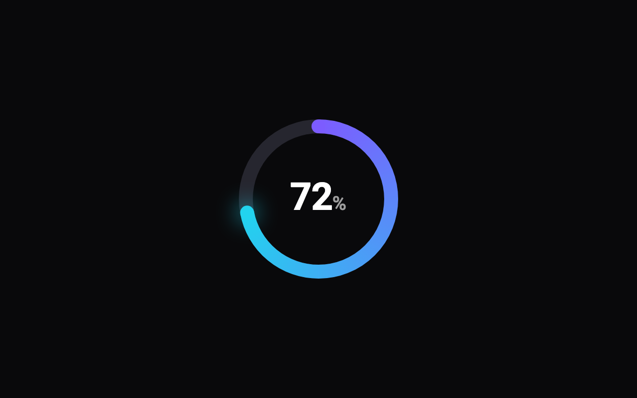
How far round the ring is filled, in percent; change it to watch the ring sweep on from where it is.
The ring's diameter.
The width of the ring's stroke.
The colour where the arc begins, at the top.
The colour at the arc's tip; the arc blends from the start colour to this.
The faint full circle behind the arc.
How strongly the arc's tip glows; 0 turns the glow off.
Shows the percentage in the centre, counting up in step with the sweep.
The colour of the percentage.
Seconds the sweep to a new value takes.
How far past 100% the ring has gone, added once the value is 100: 18 shows 118%. The arc stays full and a second lap runs round on top of it, with the number counting past 100.
The colour of the second lap past 100%.
How many tick marks sit round the inside of the ring; 0 shows none. Ticks the arc has reached are brighter.
How long each tick mark is.
The percentage where the arc begins to shift to the warning colour, blending smoothly as the value crosses it. 0 turns the warning zone off.
The percentage where the arc begins to shift on to the danger colour. 0 turns the danger zone off.
The colour the arc shifts to past the warning threshold.
The colour the arc shifts to past the danger threshold.
When the ring reaches 100%, the arc shifts to the completion colour and gives one soft pulse; with reduced motion it just shifts.
The colour of the arc once it is complete, and of the pulse.
Loading Preview…
Send to your coding agent
Add Sheen's MCP server once, then paste the prompt. No key or account needed.
claude mcp add --transport http sheen https://sheen.ciroapps.com/api/mcp
Use the Sheen MCP server to add the Ring Progress Component to this Flutter app. Call get_export with componentId "ring-progress" and parameters {"value":72,"size":160,"thickness":14,"colorA":"7C5CFF","colorB":"22D3EE","trackColor":"26262F","glow":0.6,"showLabel":true,"labelColor":"FFFFFF","duration":1.2,"overage":0,"overageColor":"4A2FD0","ticks":0,"tickLength":6,"warnAt":0,"dangerAt":0,"warnColor":"FFB020","dangerColor":"FF453A","celebrate":false,"completeColor":"34D399"}, then follow the install steps it returns. (Tuned in the Sheen Playground: https://sheen.ciroapps.com/c/ring-progress?value=72&size=160&thickness=14&colorA=7C5CFF&colorB=22D3EE&trackColor=26262F&glow=0.6&showLabel=true&labelColor=FFFFFF&duration=1.2&overage=0&overageColor=4A2FD0&ticks=0&tickLength=6&warnAt=0&dangerAt=0&warnColor=FFB020&dangerColor=FF453A&celebrate=false&completeColor=34D399)