Parameters
The button selected at first, counting from 0; -1 selects none. Past the last button, the last one is selected.
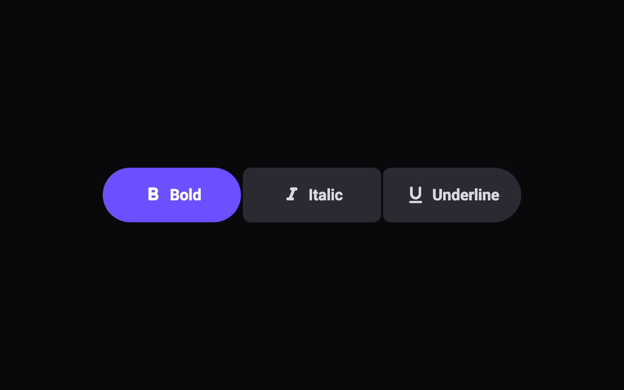
On, each button toggles on its own, like Bold and Italic. Off, choosing one button deselects the others, like Day, Week and Month.
An icon before the label. With an empty label, the button shows the icon alone.
The fill of the selected buttons.
The fill of the buttons that aren't selected.
The label and icon colour of the buttons that aren't selected.
The buttons' height in logical pixels; labels and icons scale with it. Large text makes it taller when it needs to.
The radius of the corners where buttons meet. The group's outer corners, and every corner of a selected button, are fully round.
How much the press and the corner morph overshoot before they settle.
Loading Preview…
Send to your coding agent
Add Sheen's MCP server once, then paste the prompt. No key or account needed.
claude mcp add --transport http sheen https://sheen.ciroapps.com/api/mcp
Use the Sheen MCP server to add the Connected Button Group Component to this Flutter app. Call get_export with componentId "connected-button-group" and parameters {"buttonCount":3,"selected":0,"multiSelect":true,"label1":"Bold","icon1":"bold","label2":"Italic","icon2":"italic","label3":"Underline","icon3":"underline","label4":"List","icon4":"list","label5":"Grid","icon5":"grid","accentColor":"6C4FFF","surfaceColor":"2A2A33","textColor":"D9D9E3","selectedTextColor":"FFFFFF","height":56,"innerRadius":8,"bounciness":0.5}, then follow the install steps it returns. (Tuned in the Sheen Playground: https://sheen.ciroapps.com/c/connected-button-group?buttonCount=3&selected=0&multiSelect=true&label1=Bold&icon1=bold&label2=Italic&icon2=italic&label3=Underline&icon3=underline&label4=List&icon4=list&label5=Grid&icon5=grid&accentColor=6C4FFF&surfaceColor=2A2A33&textColor=D9D9E3&selectedTextColor=FFFFFF&height=56&innerRadius=8&bounciness=0.5)