Catalog

Every Component comes as Flutter source you own. Open one to tune it.

Buttons & controls
Buttons & controls

Connected Button Group

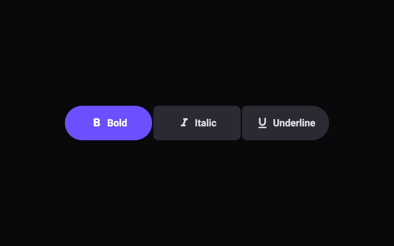
A Material 3 Expressive connected button group: two to five buttons joined by hairline gaps, whose selected buttons morph from tight inner corners to a full pill and fill with colour, and which widen on a spring while pressed as their neighbours squeeze to make room. Single- or multi-select.

  • motion component
  • iOS
  • Android
  • Flutter 3.47.0+

Buttons & controls

Morphing Action Button

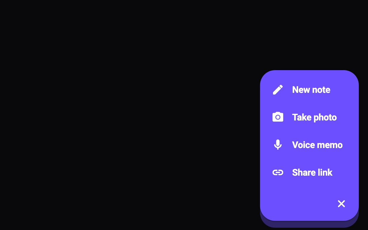
A floating action button that, when tapped, stretches on springs into a rounded panel of up to four actions, its + turning into a close mark as the actions cascade in.

  • motion component
  • iOS
  • Android
  • Flutter 3.47.0+

Buttons & controls

Segmented Control

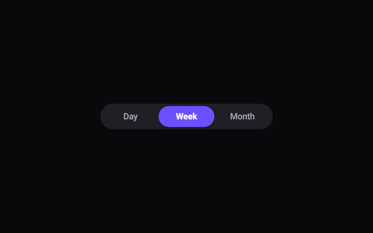
An iOS 26-style segmented control: a selection pill that springs between two to five segments, stretching as it travels, which you can tap or drag, while the labels crossfade to bold.

  • motion component
  • iOS
  • Android
  • Flutter 3.47.0+

Buttons & controls

Split Button

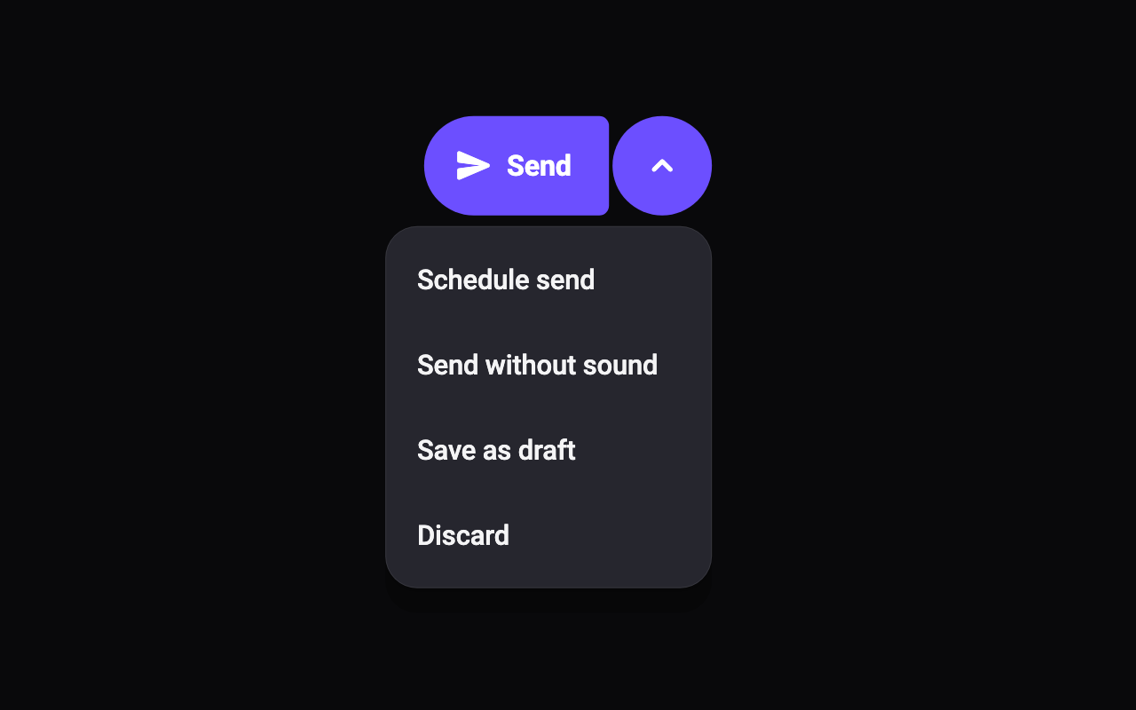
Material 3 Expressive's split button: a primary action joined to a chevron whose corners spring rounder under your thumb, opening a menu that unfolds on a spring with its items cascading in.

  • motion component
  • iOS
  • Android
  • Flutter 3.47.0+

Buttons & controls

Spring Press Button

A button that squashes when pressed and springs back, with an optional haptic tick, so taps feel physical.

  • motion component
  • iOS
  • Android
  • Flutter 3.47.0+

Buttons & controls

State Button

One button that morphs through its states: a label pill that shrinks to a spinner (or fills with a percentage) while it works, springs into a check that draws itself in, and settles back, with an error state that shakes and tints red.

  • motion component
  • iOS
  • Android
  • Flutter 3.47.0+