Parameters
Whether the panel starts open. After a tap the button keeps its own state, and follows this again only when it changes.
How many action rows the panel holds: the first ones of the four below.
The fill of the button and of the panel it becomes.
The + / close mark and the action icons.
The action labels.
The diameter of the closed button, in logical pixels. 56 is Material's standard.
The radius of the open panel's corners; the closed button is always a circle.
How much the morph overshoots and wobbles as it settles. 0 settles without overshoot.
Loading Preview…
Send to your coding agent
Add Sheen's MCP server once, then paste the prompt. No key or account needed.
Run in your project (Claude Code)
claude mcp add --transport http sheen https://sheen.ciroapps.com/api/mcp
Then ask your agent
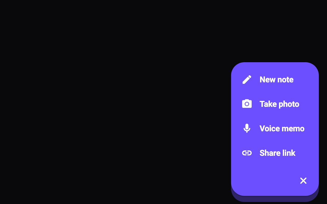
Use the Sheen MCP server to add the Morphing Action Button Component to this Flutter app. Call get_export with componentId "morphing-action-button" and parameters {"open":true,"actionCount":4,"label1":"New note","icon1":"edit","label2":"Take photo","icon2":"camera","label3":"Voice memo","icon3":"mic","label4":"Share link","icon4":"link","color":"6C4FFF","iconColor":"FFFFFF","textColor":"FFFFFF","size":60,"cornerRadius":26,"bounciness":0.4}, then follow the install steps it returns. (Tuned in the Sheen Playground: https://sheen.ciroapps.com/c/morphing-action-button?open=true&actionCount=4&label1=New+note&icon1=edit&label2=Take+photo&icon2=camera&label3=Voice+memo&icon3=mic&label4=Share+link&icon4=link&color=6C4FFF&iconColor=FFFFFF&textColor=FFFFFF&size=60&cornerRadius=26&bounciness=0.4)