Parameters
The icon before the label, or none for the label on its own.
Whether the menu starts open. On by default so the Preview shows the menu; in an app, pass open: false. After a tap the button keeps its own state, and follows this again only when it changes.
The fill of both segments.
The label, the icon and the chevron.
The button's height in logical pixels; the label, icon and padding scale with it. 40 is Material's small split button, 56 its medium one.
How much the corners and the menu overshoot and wobble as they settle. 0 settles without overshoot.
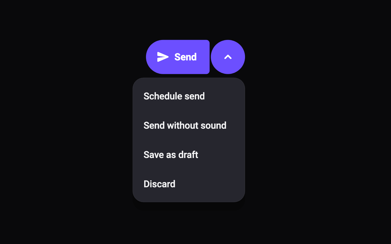
Loading Preview…
Send to your coding agent
Add Sheen's MCP server once, then paste the prompt. No key or account needed.
Run in your project (Claude Code)
claude mcp add --transport http sheen https://sheen.ciroapps.com/api/mcp
Then ask your agent
Use the Sheen MCP server to add the Split Button Component to this Flutter app. Call get_export with componentId "split-button" and parameters {"label":"Send","icon":"send","menuCount":4,"menuLabel1":"Schedule send","menuLabel2":"Send without sound","menuLabel3":"Save as draft","menuLabel4":"Discard","open":true,"color":"6C4FFF","textColor":"FFFFFF","menuColor":"26262E","height":56,"bounciness":0.5}, then follow the install steps it returns. (Tuned in the Sheen Playground: https://sheen.ciroapps.com/c/split-button?label=Send&icon=send&menuCount=4&menuLabel1=Schedule+send&menuLabel2=Send+without+sound&menuLabel3=Save+as+draft&menuLabel4=Discard&open=true&color=6C4FFF&textColor=FFFFFF&menuColor=26262E&height=56&bounciness=0.5)